CSS3 拯救我的布局吧box-sizing
一、CSS常见的两栏布局
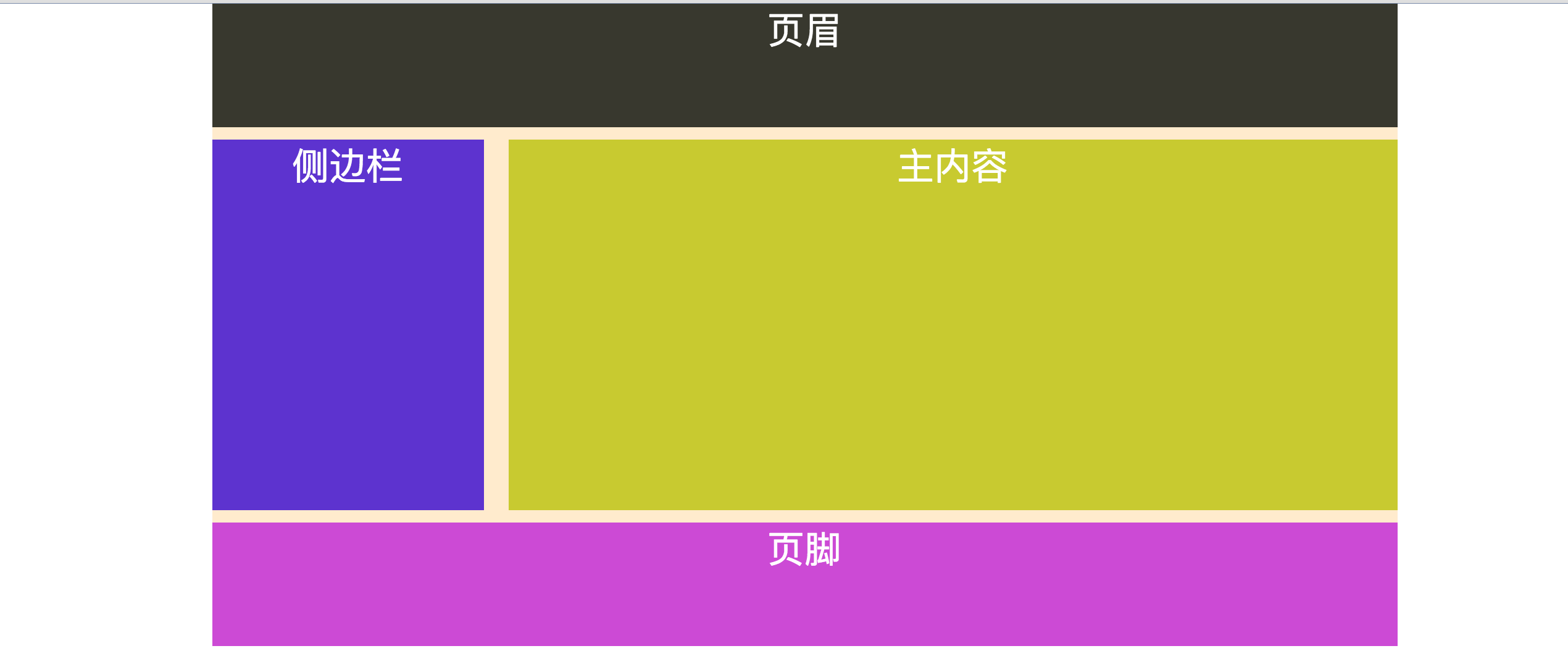
如上图,是一个很简单的两栏布局,就是一个宽度为960px;并且页面居中显示,侧边栏栏宽度为220px;主内容宽度720px;两者有一个20px的间距,并且有页眉和页脚。
代码也很简单:
 <!DOCTYPE HTML PUBLIC "-//W3C//DTD HTML 4.01 Transitional//EN" "http://www.w3.org/TR/html4/loose.dtd">

<html>

 <head lang="en-US">

  <title> 两栏布局</title>

 </head>

<style type="text/css">

*{

  margin:0;

  padding:0;

}

.wrapper{

  width:960px;

  margin-left:auto;

  margin-right: auto;

  color:#fff;

  font-size:30px;

  text-align:center;

  background: blanchedalmond;

}

#header{

  height:100px;

  background:#38382e;

  margin-bottom:10px;

}

.side{

float:left;

width:220px;

margin-right: 20px;

margin-bottom:10px;

height:300px;

background:#5d33cf;

}

.content{

  float:left;

  width:720px;

  height:300px;

  background:#c8ca30;

  margin-bottom:10px;

}

#footer{

  background:#cc4ad5;

  height:100px;

  clear: both;/*清除浮动*/

}

</style>

 <body>

<div class="wrapper">

  <div id="header">页眉</div>

  <div class="side">侧边栏</div>

  <div class="content">主内容</div>

  <div id="footer">页脚</div>

</div>

 </body>

</html>
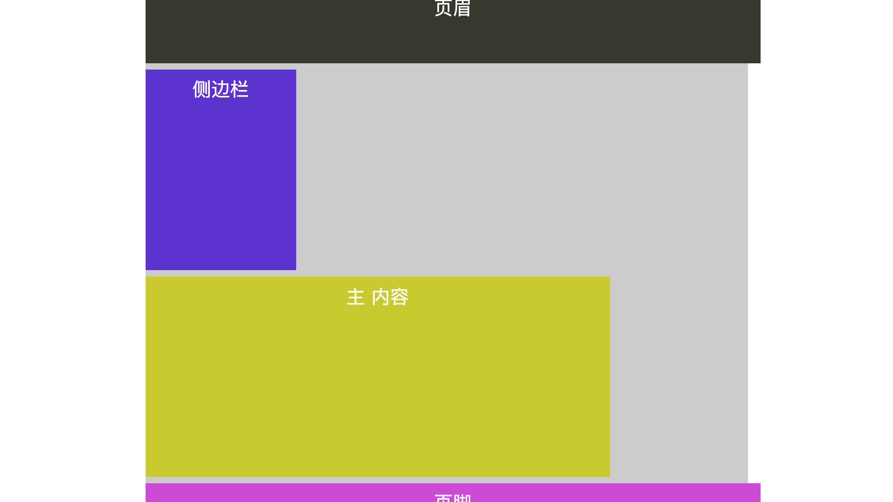
目前的布局一点问题都没有,因为容器子元素的宽度,间距加起来刚好和容器wrapper相等,但有时候布局很容易被破坏,比如给容器中的一些子元素改变属性址,比如给side和content增加padding属性。
<!DOCTYPE HTML>

<html lang="en-US">

<head>

    <meta charset="UTF-8">

    <title>box-sizing拯救了我们的布局</title>

<style type="text/css">

*{

    margin: 0;

    padding: 0;

}

.wrapper {

    width: 960px;

    margin-left: auto;

    margin-right: auto;

    color:#fff;

    font-size: 30px;

    text-align: center;

    background: #ccc;

}

#header {

    height: 100px;

    background: #38382e;

    margin-bottom: 10px;

    padding: 10px;

    width: 100%;

}

.side {

    float: left;

    width: 220px;

    margin-right: 20px;

    margin-bottom: 10px;

    height: 300px;

    background: #5d33cf;

    padding: 10px;

}

.content {

    float: left;

    width: 720px;

    height: 300px;

    background: #c8ca30;

    margin-bottom: 10px;

    padding: 10px;

}

#footer {

    background: #cc4ad5;

    height: 100px;

    text-align: center;

    clear: both;

    padding: 10px;

    width: 100%;

}

</style>

</head>

<body>

    <div class="wrapper">

        <div id="header">页眉</div>

        <div class="side">侧边栏</div>

        <div class="content">主内容</div>

        <div id="footer">页脚</div>

    </div>

</body>

</html>
因为side和content增加了padding属性,导致side元素总宽度变为240px(220+20),主内容content元素总宽度变为740px(720+20),如此一来再加上margin间距20,就变成了1000px,超过了容器wrapper的宽度,布局完全被打破,很难受很痛苦。
二、CSS3中box-sizing属性介绍
为了解决这个问题,css3增加了一个盒模型属性box-sizing,能够事先定义盒模型的尺寸解析方式。
box-sizing属性值主要有3个:
①content-box:默认值,让元素维持w3c的标准盒模型。元素的宽度盒高度(element width/height)=边框(border) +内边距(padding) +内容宽度/高度(content width/height).附:css中设的width值为content-box值。上例的两栏布局就是采用的默认值。
②border-box:此值会重新定义css2.1中盒模型组成的模式,让元素维持ie传统的盒模型。 content width/height=element width/height-border-padding.
③inherit:继承父元素的盒模型模式
box-sizing属性主要用来控制元素的盒模型的解析方式,其目的是为了控制元素的总宽度。使布局更加方便。

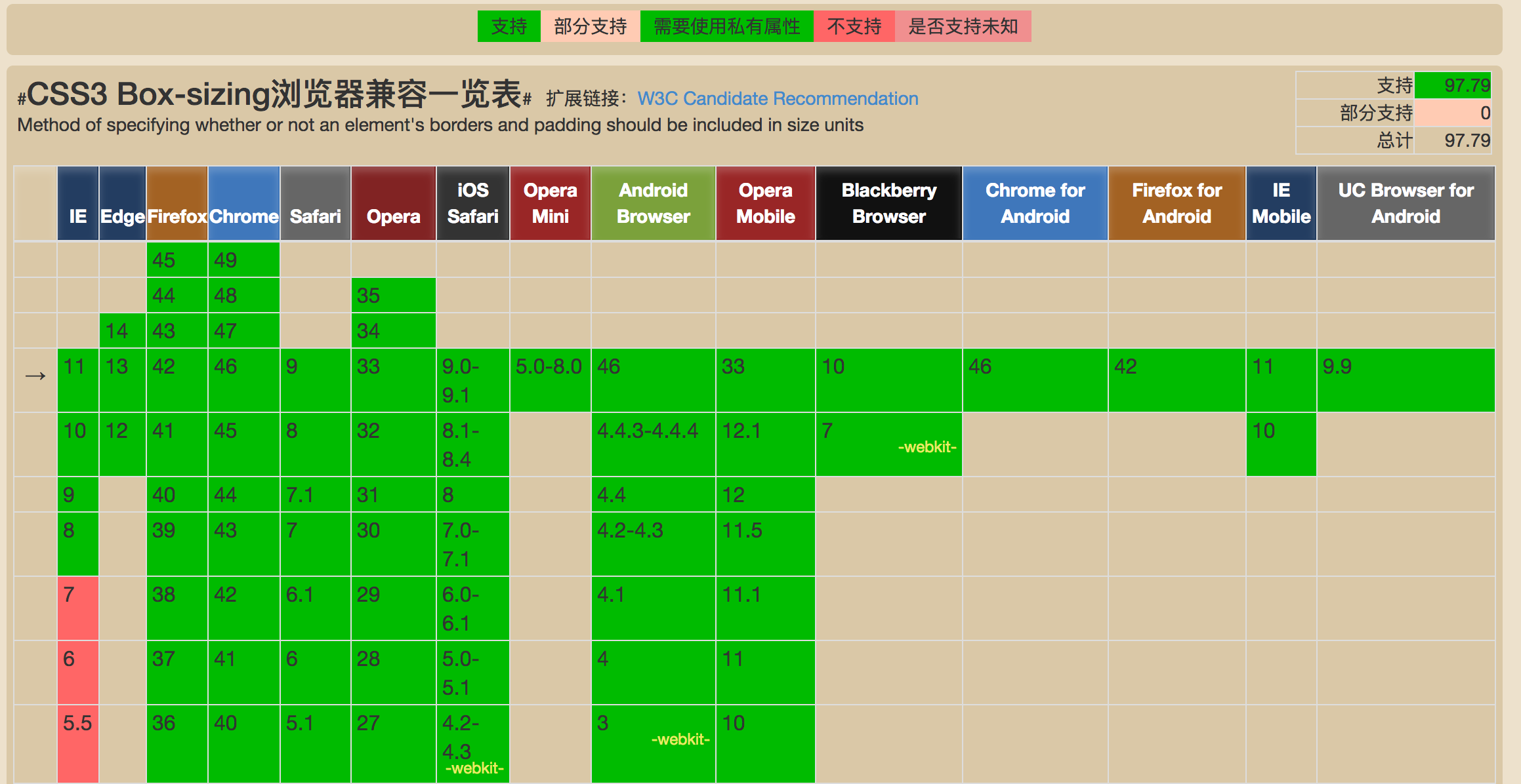
三、浏览器兼容性
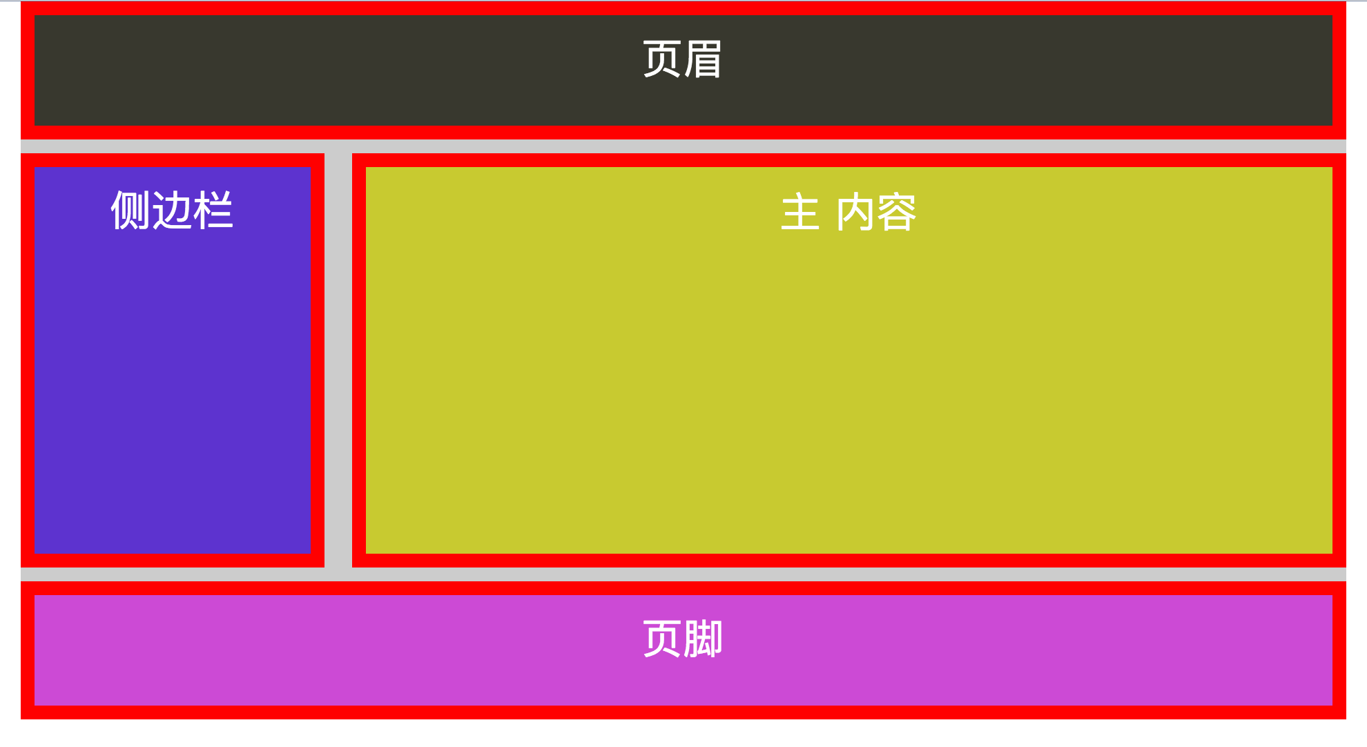
四、box-sizing改造上例两栏布局
<!DOCTYPE HTML>

<html lang="en-US">

<head>

    <meta charset="UTF-8">

    <title>box-sizing拯救了我们的布局</title>

<style type="text/css">

*{

    margin: 0;

    padding: 0;

}

.wrapper {

    width: 960px;

    margin-left: auto;

    margin-right: auto;

    color:#fff;

    font-size: 30px;

    text-align: center;

    background: #ccc;

}

#header {

    height: 100px;

    background: #38382e;

    margin-bottom: 10px;

    border: 10px solid red;

    padding: 10px;

    width: 100%;

    -moz-box-sizing: border-box;

    -webkit-box-sizing: border-box;

    -o-box-sizing: border-box;

    -ms-box-sizing: border-box;

    box-sizing: border-box;

}

.sidebar {

    float: left;

    width: 220px;

    margin-right: 20px;

    margin-bottom: 10px;

    height: 300px;

    background: #5d33cf;

    border: 10px solid red;

    padding: 10px;

    -moz-box-sizing: border-box;

    -webkit-box-sizing: border-box;

    -o-box-sizing: border-box;

    -ms-box-sizing: border-box;

    box-sizing: border-box;

}

.content {

    float: left;

    width: 720px;

    height: 300px;

    background: #c8ca30;

    margin-bottom: 10px;

    border: 10px solid red;

    padding: 10px;

    -moz-box-sizing: border-box;

    -webkit-box-sizing: border-box;

    -o-box-sizing: border-box;

    -ms-box-sizing: border-box;

    box-sizing: border-box;

}

#footer {

    background: #cc4ad5;

    height: 100px;

    text-align: center;

    clear: both;

    border: 10px solid red;

    padding: 10px;

    width: 100%;

    -moz-box-sizing: border-box;

    -webkit-box-sizing: border-box;

    -o-box-sizing: border-box;

    -ms-box-sizing: border-box;

    box-sizing: border-box;

}

</style>

</head>

<body>

    <div class="wrapper">

        <div id="header">页眉</div>

        <div class="sidebar">侧边栏</div>

        <div class="content">主内容</div>

        <div id="footer">页脚</div>

    </div>

</body>

</html>
最新文章
- Quartz.net持久化与集群部署开发详解
- 深入netty源码解析之一数据结构
- 昨天写支付接口时遇到支付接口返回数据接收地址,session数据丢失(或者说失效)的问题
- 【转】超实用的JavaScript技巧及最佳实践
- Create executable jar
- MVC 百度地图的基本使用
- 000 VS2013 c++ 框架
- java mail jar冲突
- FindControl什么时候才会使用ObjectFromHWnd函数呢?——VCL很难调试,加一个日志函数,记录时间
- LFS,编译自己的Linux系统 - 包和补丁
- 整合最优雅SSM框架:SpringMVC + Spring + MyBatis
- 告别set和get,两大利器轻松搞定model转换
- JSON C# Class Generator ---由json字符串生成C#实体类的工具
- c#编写windows服务在开机是OnStart启动超时
- linux 查看信息-服务器相关
- android自己定义换行居中CenterTextView
- Java集合框架2
- java一些使用
- 桌面不显示IE图标解决方法
- [bzoj3132]上帝造题的七分钟——二维树状数组