[R可视化]ggplot2库介绍及其实例
前言
ggplot是一个拥有一套完备语法且容易上手的绘图系统,在Python和R中都能引入并使用,在数据分析可视化领域拥有极为广泛的应用。本篇从R的角度介绍如何使用ggplot2包,首先给几个我觉得最值得推荐的理由:
- 采用“图层”叠加的设计方式,一方面可以增加不同的图之间的联系,另一方面也有利于学习和理解该
package,photoshop的老玩家应该比较能理解这个带来的巨大便利 - 适用范围广,拥有详尽的文档,通过
?和对应的函数即可在R中找到函数说明文档和对应的实例 - 在
R和Python中均可使用,降低两门语言之间互相过度的学习成本
基本概念
本文采用ggplot2的自带数据集diamonds。
> head(diamonds)

# A tibble: 6 x 10

  carat cut       color clarity depth table price     x     y     z

  <dbl> <ord>     <ord> <ord>   <dbl> <dbl> <int> <dbl> <dbl> <dbl>

1 0.23  Ideal     E     SI2      61.5    55   326  3.95  3.98  2.43

2 0.21  Premium   E     SI1      59.8    61   326  3.89  3.84  2.31

3 0.23  Good      E     VS1      56.9    65   327  4.05  4.07  2.31

4 0.290 Premium   I     VS2      62.4    58   334  4.2   4.23  2.63

5 0.31  Good      J     SI2      63.3    58   335  4.34  4.35  2.75

6 0.24  Very Good J     VVS2     62.8    57   336  3.94  3.96  2.48

# 变量含义

price  : price in US dollars (\$326–\$18,823)

carat  : weight of the diamond (0.2–5.01)

cut    :   quality of the cut (Fair, Good, Very Good, Premium, Ideal)

color  : diamond colour, from D (best) to J (worst)

clarity: a measurement of how clear the diamond is (I1 (worst), SI2, SI1, VS2, VS1, VVS2, VVS1, IF (best))

x      : length in mm (0–10.74)

y      : width in mm (0–58.9)

z      : depth in mm (0–31.8)

depth  : total depth percentage = z / mean(x, y) = 2 * z / (x + y) (43–79)

table  : width of top of diamond relative to widest point (43–95)
基于图层和画布的概念,ggplot2引申出如下的语法框架:
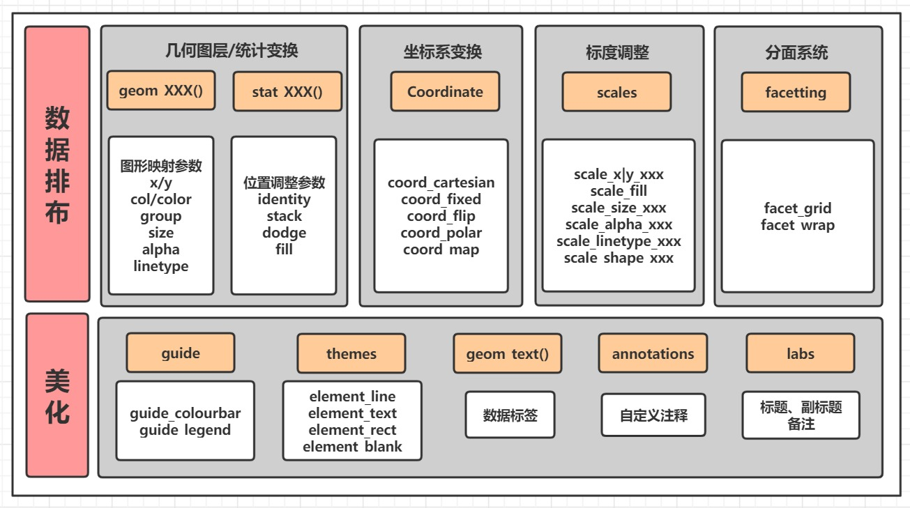
data:数据源,一般是data.frame结构,否则会被转化为该结构- 个性映射与共性映射:
ggplot()中的mapping = aes()参数属于共性映射,会被之后的geom_xxx()和stat_xxx()所继承,而geom_xxx()和stat_xxx()中的映射参数属于个性映射,仅作用于内部 mapping:映射,包括颜色类型映射color;fill、形状类型映射linetype;size;shape和位置类型映射x,y等geom_xxx:几何对象,常见的包括点图、折线图、柱形图和直方图等,也包括辅助绘制的曲线、斜线、水平线、竖线和文本等aesthetic attributes:图形参数,包括colour;size;hape等facetting:分面,将数据集划分为多个子集subset,然后对于每个子集都绘制相同的图表theme:指定图表的主题
ggplot(data = NALL, mapping = aes(x = , y = )) +   # 数据集

    geom_xxx()|stat_xxx() +       # 几何图层/统计变换

    coord_xxx() +  # 坐标变换, 默认笛卡尔坐标系

    scale_xxx() +  # 标度调整, 调整具体的标度

    facet_xxx() +  # 分面, 将其中一个变量进行分面变换

    guides() +     # 图例调整

    theme()        # 主题系统
这些概念可以等看完全文再回过头看,相当于一个汇总,这些概念都掌握了基本
ggplot2的核心逻辑也就理解了
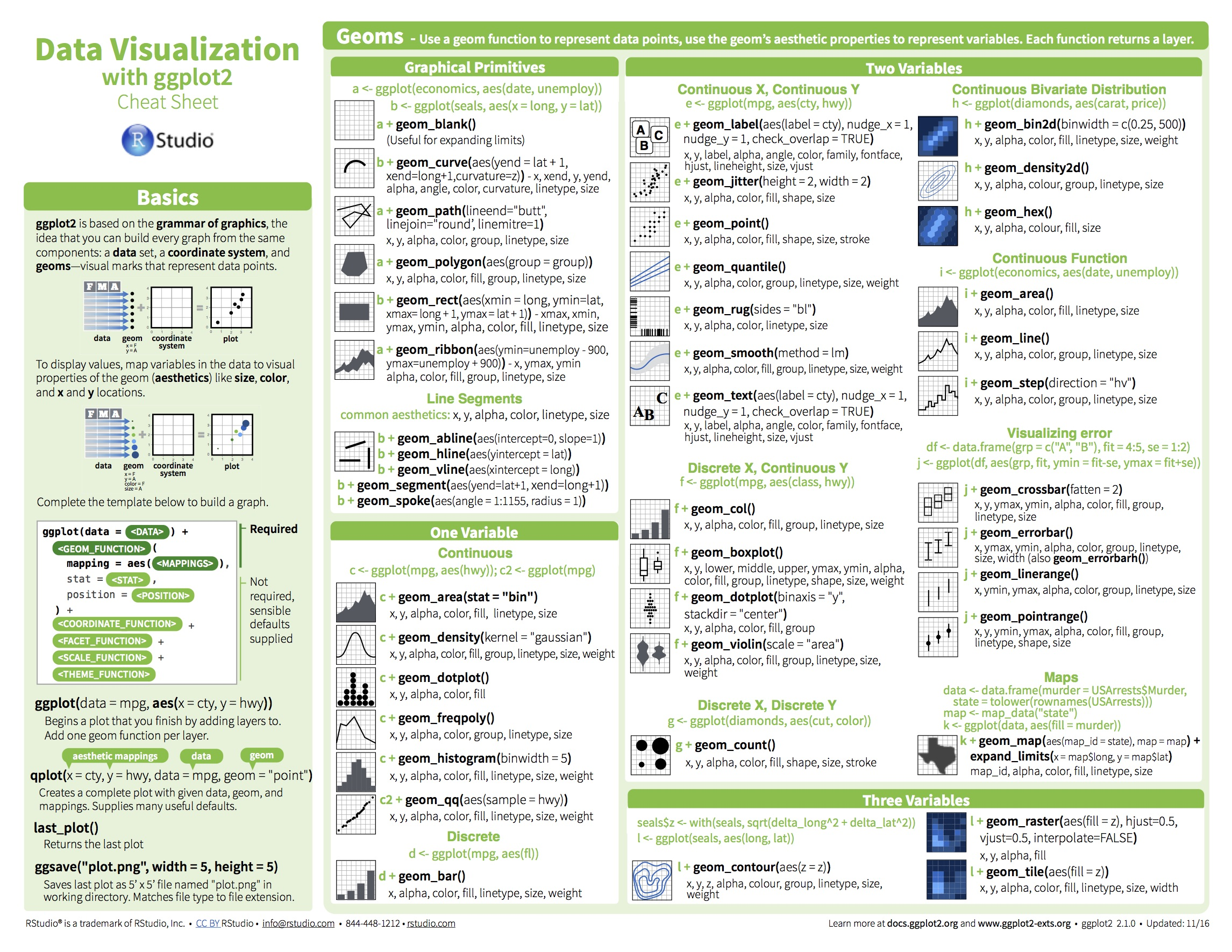
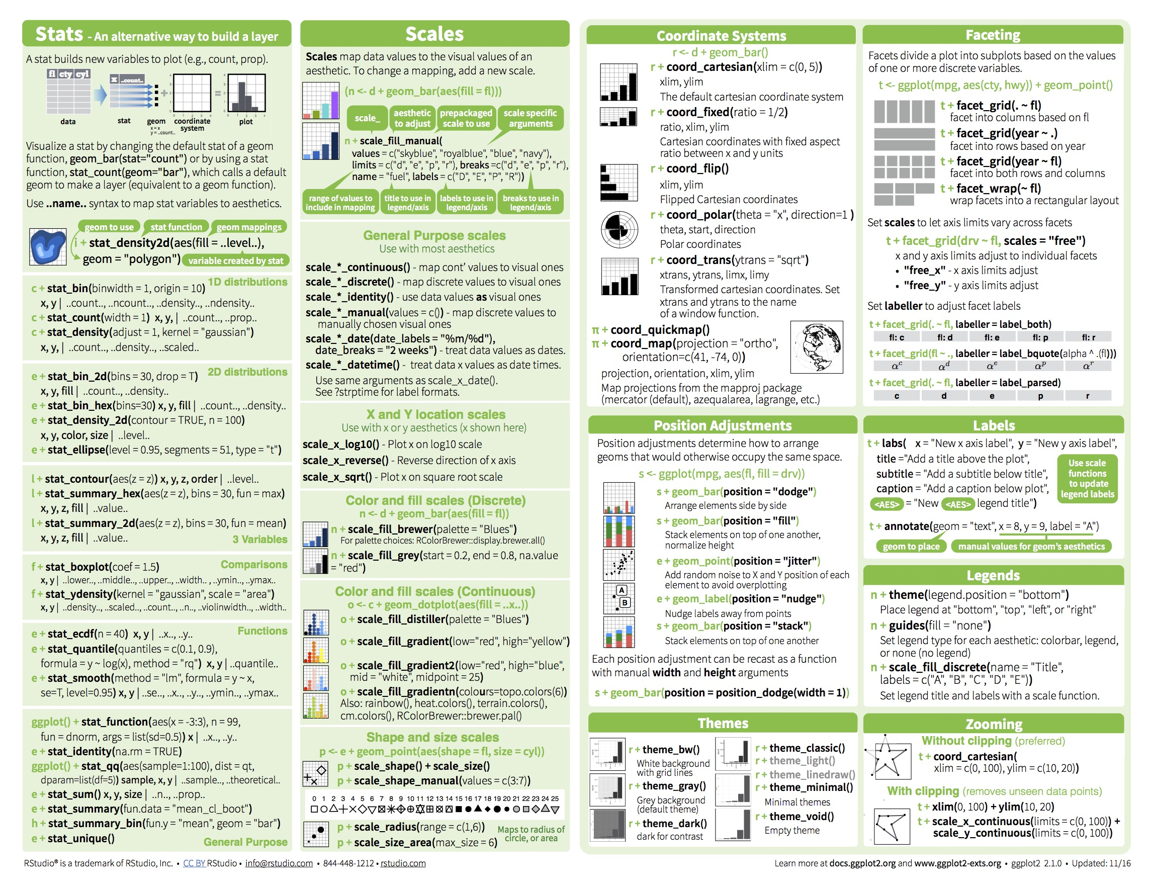
一些核心概念的含义可以从RStudio官方的cheat sheet图中大致得知:
一些栗子
通过实例和
RCode从浅到深介绍ggplot2的语法。
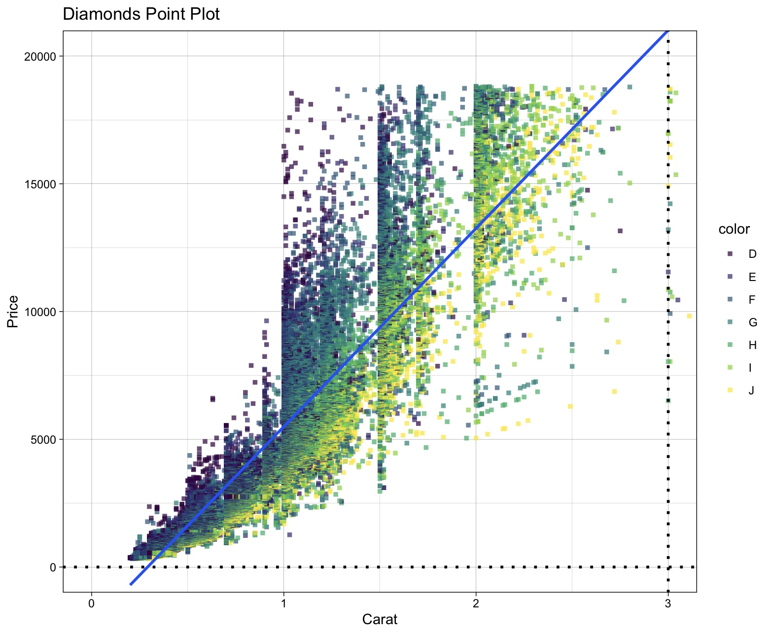
1. 五脏俱全的散点图
library(ggplot2)

# 表明我们使用diamonds数据集,

ggplot(diamonds) +

  # 绘制散点图: 横坐标x为depth, 纵坐标y为price, 点的颜色通过color列区分,alpha透明度,size点大小,shape形状(实心正方形),stroke点边框的宽度

  geom_point(aes(x = carat, y = price, colour = color), alpha=0.7, size=1.0, shape=15, stroke=1) +

  # 添加拟合线

  geom_smooth(aes(x = carat, y = price), method = 'glm') +

  # 添加水平线

  geom_hline(yintercept = 0, size = 1, linetype = "dotted", color = "black") +

  # 添加垂直线

  geom_vline(xintercept = 3, size = 1, linetype = "dotted", color = "black") +

  # 添加坐标轴与图像标题

  labs(title = "Diamonds Point Plot", x = "Carat", y = "Price") +

  # 调整坐标轴的显示范围

  coord_cartesian(xlim = c(0, 3), ylim = c(0, 20000)) +

  # 更换主题, 这个主题比较简洁, 也可以在ggthemes包中获取其他主题

  theme_linedraw()
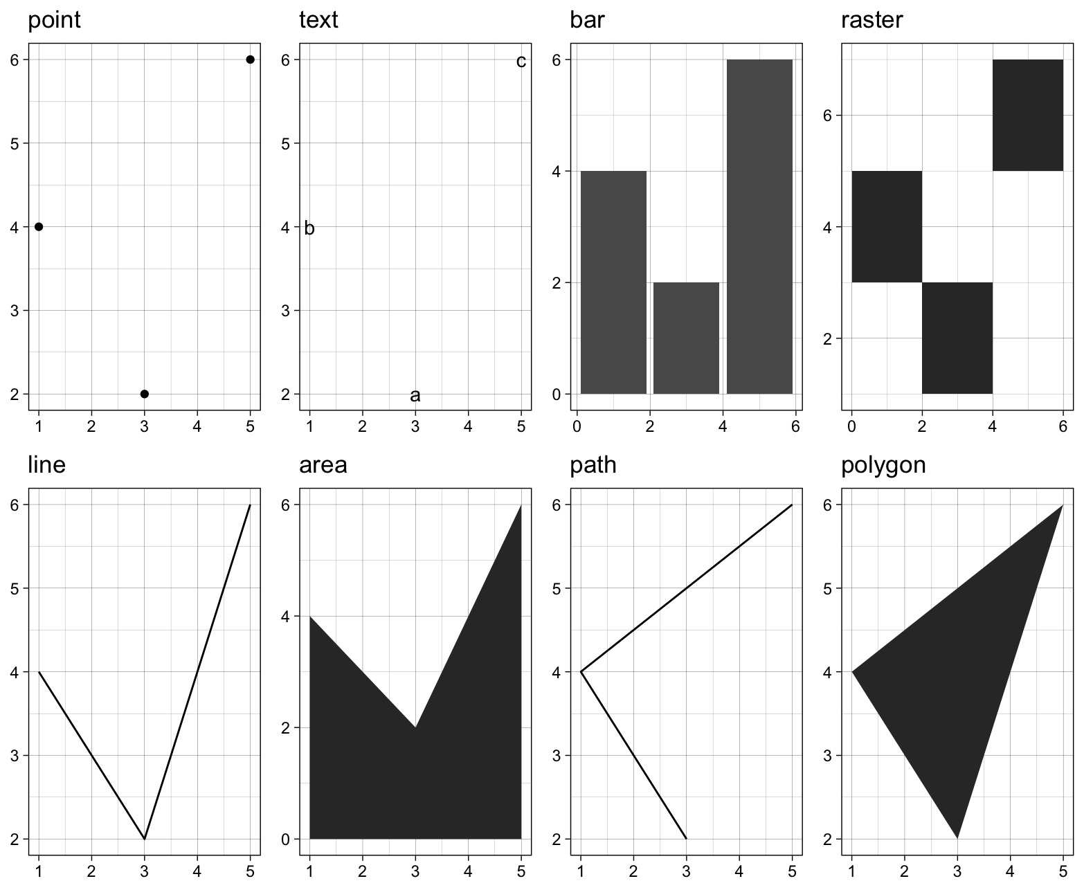
2. 自定义图片布局&多种几何绘图
library(gridExtra)

#建立数据集

df <- data.frame(

  x = c(3, 1, 5),

  y = c(2, 4, 6),

  label = c("a","b","c")

)

p <- ggplot(df, aes(x, y, label = label)) +

  # 去掉横坐标信息

  labs(x = NULL, y = NULL) +

  # 切换主题

  theme_linedraw()

p1 <- p + geom_point() + ggtitle("point")

p2 <- p + geom_text() + ggtitle("text")

p3 <- p + geom_bar(stat = "identity") + ggtitle("bar")

p4 <- p + geom_tile() + ggtitle("raster")

p5 <- p + geom_line() + ggtitle("line")

p6 <- p + geom_area() + ggtitle("area")

p7 <- p + geom_path() + ggtitle("path")

p8 <- p + geom_polygon() + ggtitle("polygon")

# 构造ggplot图片列表

plots <- list(p1, p2, p3, p4, p5, p6, p7, p8)

# 自定义图片布局

gridExtra::grid.arrange(grobs = plots, ncol = 4)
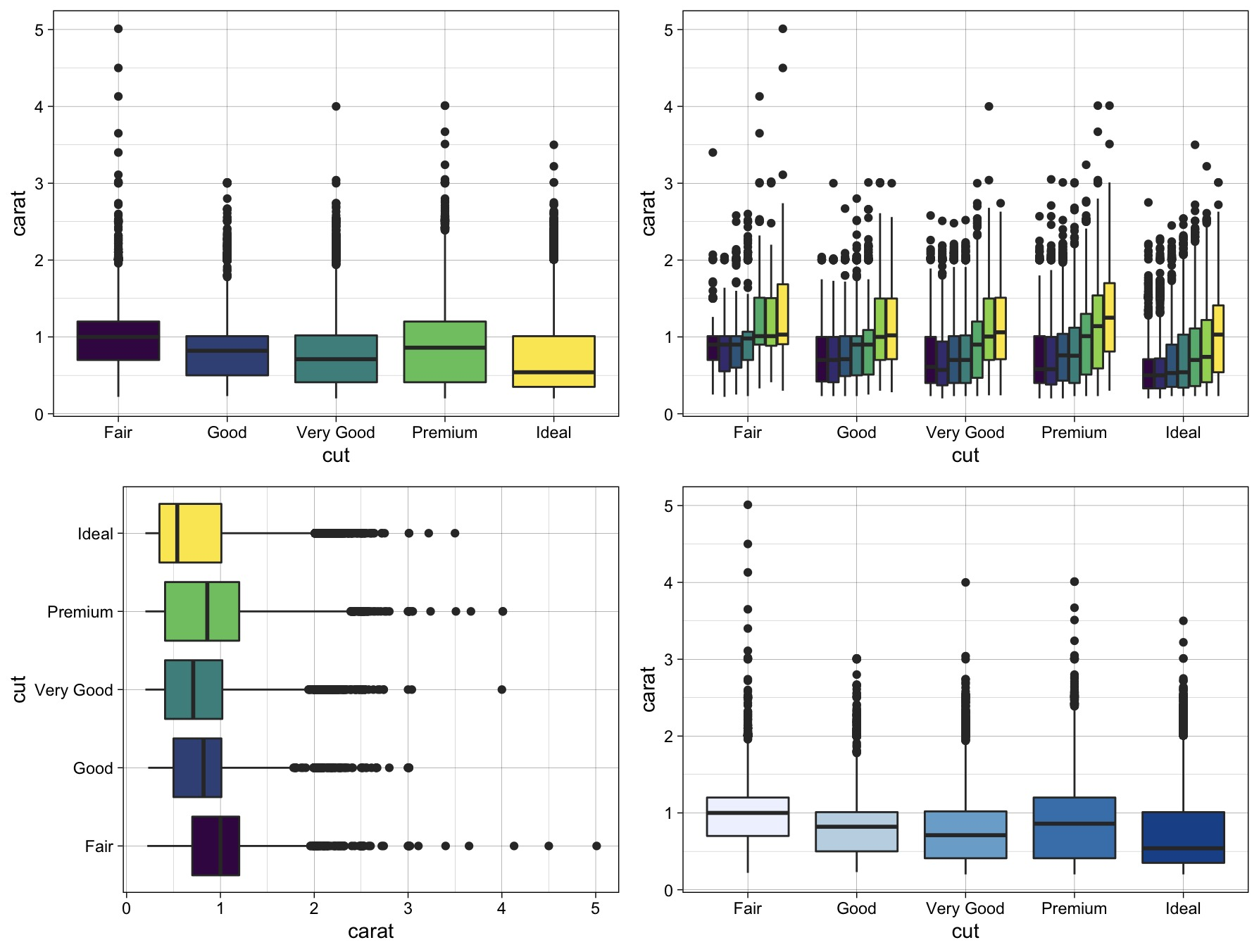
3. 箱线图
统计学中展示数据分散情况的直观图形,在探索性分析中常常用于展示在某个因子型变量下因变量的分散程度。
下面展示箱线图最长使用的一些方法:
library(ggplot2) # 绘图

library(ggsci)   # 使用配色

# 使用diamonds数据框, 分类变量为cut, 目标变量为depth

p <- ggplot(diamonds, aes(x = cut, y = carat)) +

  theme_linedraw()

# 一个因子型变量时, 直接用颜色区分不同类别, 后面表示将图例设置在右上角

p1 <- p + geom_boxplot(aes(fill = cut)) + theme(legend.position = "None")

# 两个因子型变量时, 可以将其中一个因子型变量设为x, 将另一个因子型变量设为用图例颜色区分

p2 <- p + geom_boxplot(aes(fill = color)) + theme(legend.position = "None")

# 将箱线图进行转置

p3 <- p + geom_boxplot(aes(fill = cut)) + coord_flip() + theme(legend.position = "None")

# 使用现成的配色方案: 包括scale_fill_jama(), scale_fill_nejm(), scale_fill_lancet(), scale_fill_brewer()(蓝色系)

p4 <- p + geom_boxplot(aes(fill = cut)) + scale_fill_brewer() + theme(legend.position = "None")

# 构造ggplot图片列表

plots <- list(p1, p2, p3, p4)

# 自定义图片布局

gridExtra::grid.arrange(grobs = plots, ncol = 2)
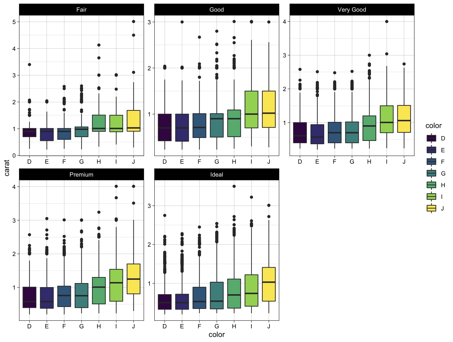
当研究某个连续型变量的箱线图涉及多个离散型分类变量时,我们常使用分面facetting来提高图表的可视性。
library(ggplot2)

ggplot(diamonds, aes(x = color, y = carat)) +

  # 切换主题

  theme_linedraw() +

  # 箱线图颜色根据因子型变量color填色

  geom_boxplot(aes(fill = color)) +

  # 分面: 本质上是将数据框按照因子型变量color类划分为多个子数据集subset, 在每个子数据集上绘制相同的箱线图

  # 注意一般都要加scales="free", 否则子数据集数据尺度相差较大时会被拉扯开

  facet_wrap(~cut, scales="free")
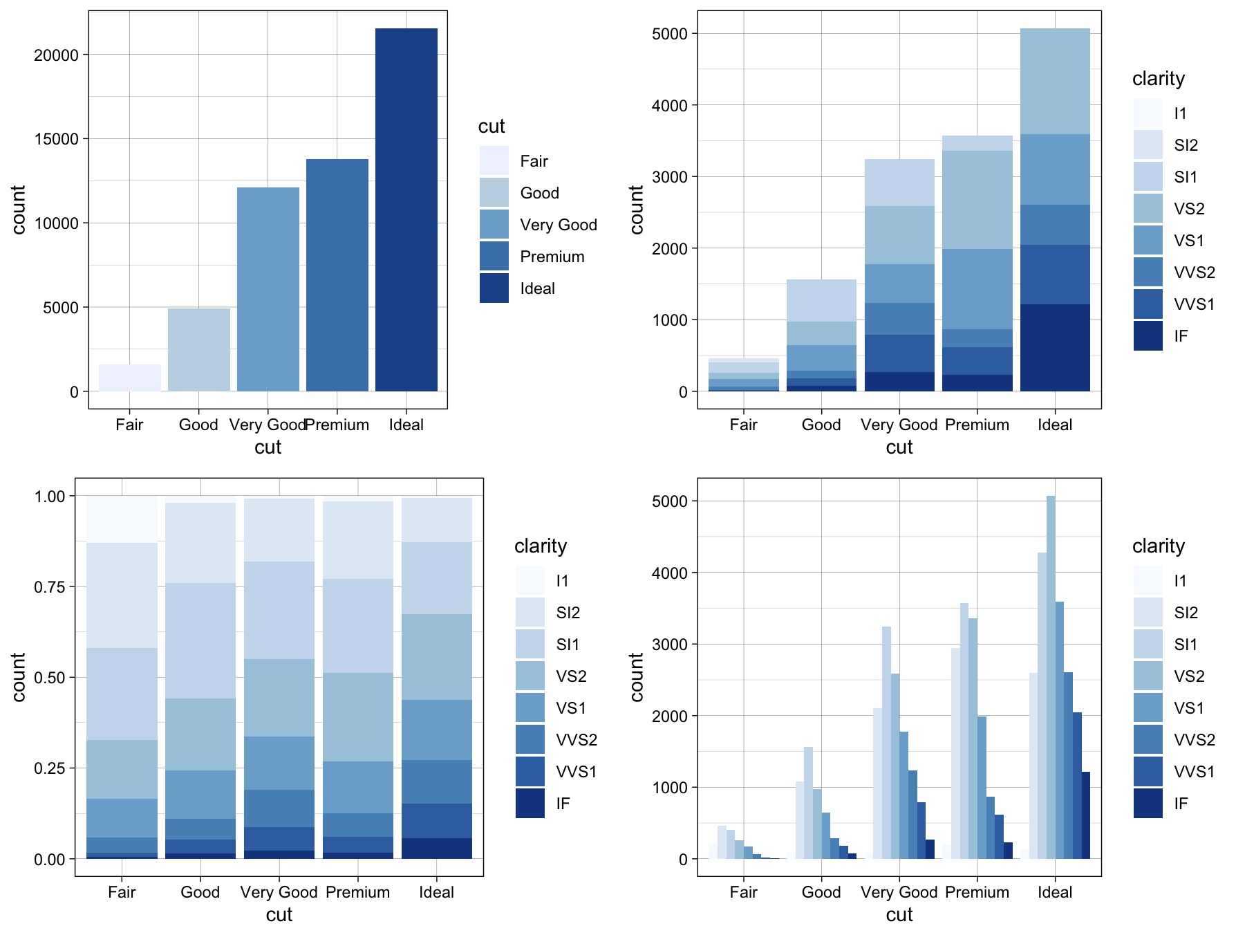
4. 直方图
library(ggplo2)

# 普通的直方图

p1 <- ggplot(data = diamonds) +

  geom_bar(mapping = aes(x = cut, fill = cut)) +

  theme_linedraw() +

  scale_fill_brewer()

# 堆积直方图

p2 <- ggplot(data = diamonds) +

  geom_bar(mapping = aes(x = cut, fill = clarity), position = "identity") +

  theme_linedraw() +

  scale_fill_brewer()

# 累积直方图

p3 <- ggplot(data = diamonds) +

  geom_bar(mapping = aes(x = cut, fill = clarity), position = "fill") +

  theme_linedraw() +

  scale_fill_brewer()

# 分类直方图

p4 <- ggplot(data = diamonds) +

  geom_bar(mapping = aes(x = cut, fill = clarity), position = "dodge") +

  theme_linedraw() +

  scale_fill_brewer()

# 构造ggplot图片列表

plots <- list(p1, p2, p3, p4)

# 自定义图片布局

gridExtra::grid.arrange(grobs = plots, ncol = 2)
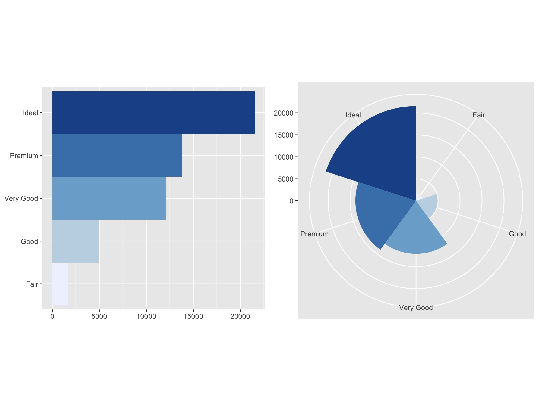
5. 坐标系统
除了前面箱线图使用的coord_flip()方法实现了坐标轴转置,ggplot还提供了很多和坐标系统相关的功能。
library(ggplot2)

bar <- ggplot(data = diamonds) +

  geom_bar(mapping = aes(x = cut, fill = cut), show.legend = FALSE, width = 1) +

  # 指定比率: 长宽比为1, 便于展示图形

  theme(aspect.ratio = 1) +

  scale_fill_brewer() +

  labs(x = NULL, y = NULL)

# 坐标轴转置

bar1 <- bar + coord_flip()

# 绘制极坐标

bar2 <- bar + coord_polar()

# 构造ggplot图片列表

plots <- list(bar1, bar2)

# 自定义图片布局

gridExtra::grid.arrange(grobs = plots, ncol = 2)
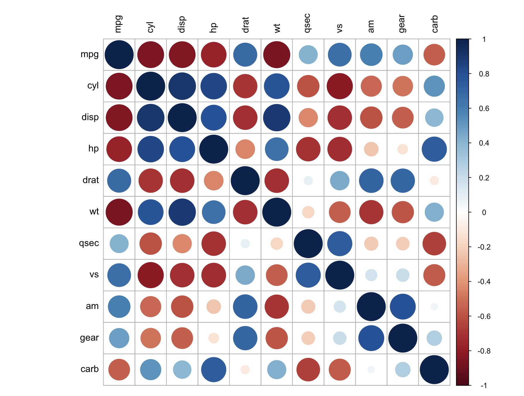
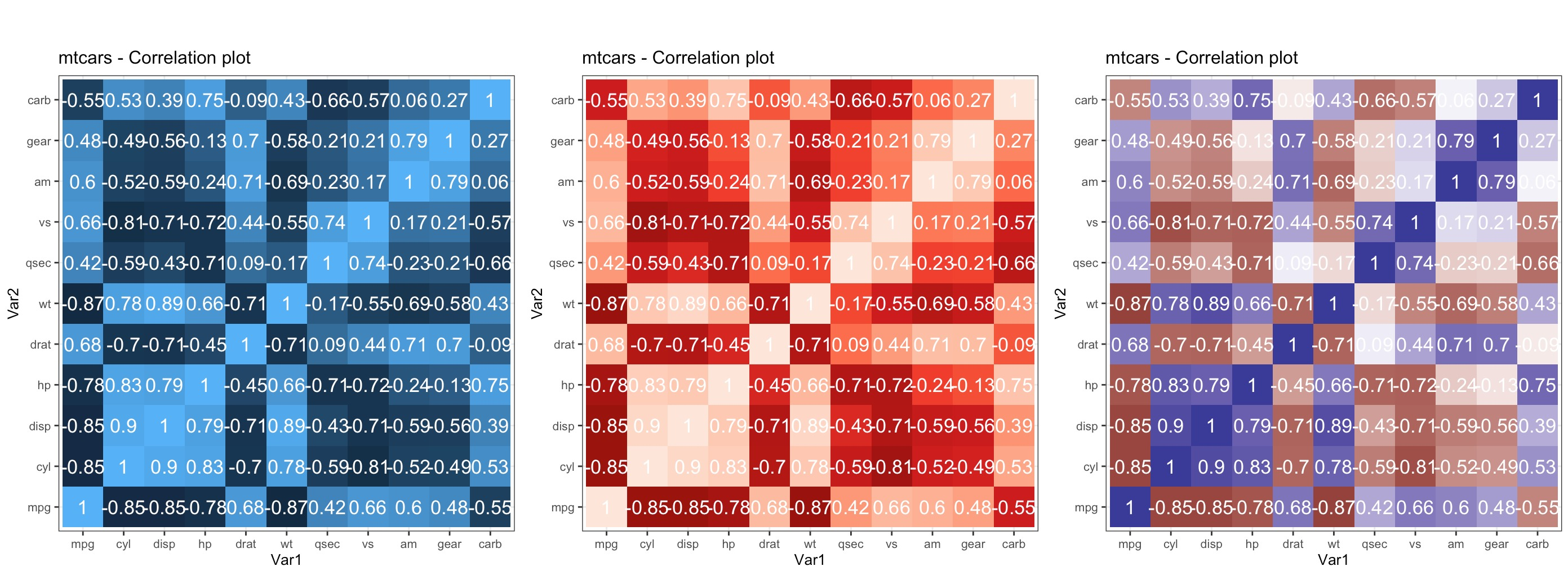
6. 瓦片图、 热力图
机器学习中探索性分析我们可以通过corrplot直接绘制所有变量的相关系数图,用于判断总体的相关系数情况。
library(corrplot)

#计算数据集的相关系数矩阵并可视化

mycor = cor(mtcars)

corrplot(mycor, tl.col = "black")
ggplot提供了更加个性化的瓦片图绘制:
library(RColorBrewer)

# 生成相关系数矩阵

corr <- round(cor(mtcars), 2)

df <- reshape2::melt(corr)

p1 <- ggplot(df, aes(x = Var1, y = Var2, fill = value, label = value)) +

  geom_tile() +

  theme_bw() +

  geom_text(aes(label = value, size = 0.3), color = "white") +

  labs(title = "mtcars - Correlation plot") +

  theme(text = element_text(size = 10), legend.position = "none", aspect.ratio = 1)

p2 <- p1 + scale_fill_distiller(palette = "Reds")

p3 <- p1 + scale_fill_gradient2()

gridExtra::grid.arrange(p1, p2, p3, ncol=3)
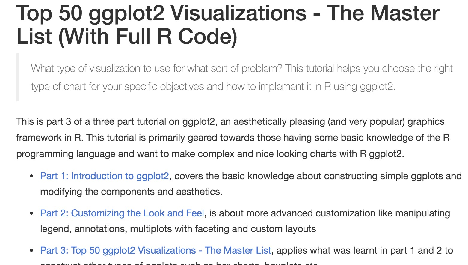
更多例子
有经典的50个ggplot2绘图示例:
http://r-statistics.co/Top50-Ggplot2-Visualizations-MasterList-R-Code.html
Reference
[1] https://ggplot2-book.org/introduction.html#welcome-to-ggplot2
[2] https://rstudio.com/resources/cheatsheets/
[3] https://r4ds.had.co.nz/data-visualisation.html
[4] https://www.sohu.com/a/320024110_718302
最新文章
- C#创建dll类库
- 【Beta】Daily Scrum Meeting第五次
- SQL Server 日期函数:EOMonth、DateFormat、Format、DatePart、DateName
- 【转】常见的python机器学习工具包比较
- 模拟 --- hdu 12878 : Fun With Fractions
- Another app is currently holding the yum lock; waiting for it to exit...另一个应用程序在占用yum lock,等待其退出。
- 【英语】Bingo口语笔记(6) - 表示“迷茫”
- entity framework 连接 oracle 发布后出现的问题(Unable to find the requested .Net Framework Data Provider)
- OpenCV中IplImage和Mat间的相互转换
- react native学习1-安装,执行
- Unix时间戳转换成C#中的DateTime
- Linux下使用ssh密钥实现无交互备份
- Ubuntu16.04.1上搭建分布式的Redis集群
- 队列(存储结构双端链表)--Java实现
- Jenkins+Jmeter持续集成笔记(四:定时任务和邮件通知)
- js 回调
- Nancy 寄宿OWin
- 列表 & 元组& join & range
- HTTPS抓包之Charles
- numpy 数据处理