HTML基础-06
网页背景
1. 设置背景颜色 background-color:#bfa;
设置背景图片 background-image:url(“./img/.....”)
注意:可以同时设置背景图片和背景颜色,这样背景颜色就会变成图片的背景色
如果背景的图片小于元素,则背景图片会自动在元素中平铺将元素铺满。
如果背景图片和元素一样大,则会直接正常显示。
设置背景的重复方式 background-repeat
可选值:repeat:默认值,背景会沿着x轴,y轴双向重复
repeat-x:沿着x方向重复
repeat-y:沿着y方向重复
no-repeat:背景图片不重复
设置背景图片的位置 background-position
方式:
(1)通过top,left,right,bittom,center几个表示方位词来设置背景,必须指定两个值,如果只写一个则第二个默认是center
background-position:top left;在图片的左上角
(2)通过偏移量来指定背景图片的位置,水平方向的偏移量,垂直方向的偏移量
background-position:100px 100px;水平偏移(x),垂直偏移(y);
第一个值,水平反向偏移量
正值背景向右移动,负值向左移动
第二个值,垂直方向的偏移量
正值向下走,负值向上走
设置背景范围:
背景显示的区域 background-clip
可选值:
border-box 背景会延伸到边框的下边
padding-box 背景会设置到内边距
content-box 背景只会设置到内容区中
背景图片的偏移量计算的原点 background-origin
padding-box:默认值,background-position从内边距开始计算
content-box:背景图片的偏移量从内容区处计算
border-box:背景图片的变量从边框处开始计算
例如:background-origin: border-box;
background-clip: border-box;
设置背景图片的尺寸 background-size
需要两个值作为参数:宽度 高度
可选值:
contain 完整显示背景图片,可能会有位置没有图片
cover 图片比例不变,使图片将元素填满,可能有部分图片从元素中溢出
background-size:如果只写一个,则第二个默认是auto;
background-size:100% auto; 图像比例不变,但是宽度充满
背景图片是否跟随元素移动 background-attachment
可选值:scroll:默认值,背景图片会跟随元素移动
fixed背景图片会固定在页面,不会随元素移动
.box1{
     width: 500px;
     height: 500px;
     overflow:auto;
     padding:10px;
     background-image:url("img/2.jpg");
     !*设置背景图片的尺寸*!
     background-size:contain;
     !*用来设置背景的重复方式*!
     background-repeat: no-repeat;
 }
 .box2{
     !*溢出*!
     height: 1000px;
     width:300px;
     background-image: url("img/1.png");
     background-repeat: no-repeat;
     !*背景图片是否跟随元素移动*!
     background-attachment:fixed;
     !*设置背景图片的位置*!
     background-position: 100px 100px;
     !*背景图片的偏移量计算的原点*!
     background-origin: border-box;
     !*设置背景显示的区域*!
     background-clip: border-box;
 }
可将所有的值通过background来设置:背景相关的简写属性,所有背景相关的样式都通过该样式来设置,并且样式之间没有顺序
注意:background-size必须写在background-position的后面,并且通过/隔开,background-position/background-size
background-origin必须在background-clip的前面
background-color
background-image
background-repeat
background-position
background-size
background-origin
background-clip
background-attachment
.box3{
    width:500px;
    height: 500px;
    background: #bfa url("img/2.jpg")  center/contain border-box content-box no-repeat fixed;
}
2. 问题:当按钮状态从link 切换到hover时 或 从hover切换到 active时,第一次会出现一个闪烁!
a:link{
display: block;
width: 93px;
height: 29px;
background: url("btn/btn.png");}
/*鼠标放上去*/
a:hover{
background: url("btn/btn.png"); }
/*点击情况下*/
a:active{
background: url("btn/btn.png");}
原因:图片属于网页中的外部资源,外部资源都需要浏览器单独发送请求加载,浏览器加载外部资源时是按需加载的,用则加载,不用则不加载。
link会首先加载,而hover和active会在指定状态触发时才会加载。加载和显示之间存在一个时间差,这样在图片加载千会出现没有背景图片的情况,导致闪烁!
解决方式:可以将多个按钮保存到一个图片中,这样我们一次性加载所有的图片,然后通过偏移量来修改需要显示的图片即可。这个技术称为CSS Sprite(CSS精灵),这种图称为雪碧图。
优点:
- 将多个图片保存到一个图片中,降低发送请求的次数,增加用户的访问速度。
- 将多个图片保存到一个图片里,也会降低图片的总大小,增快记载速度。
a:link{
display: block;
width: 93px;
height: 29px;
background: url("btn/btn.png");
}
/*鼠标放上去*/
a:hover{
background-position: -93px 0;
/*background: url("btn/btn.png");*/
}
/*点击情况下*/
a:active{
background-position: -186px 0; /*在同一个图上移动*/
/*background: url("btn/btn.png");*/
}
3. 雪碧图的使用步骤:
- 先确定要使用的图标
- 测量图标的大小,创建一个元素
- 将雪碧图设置为元素的背景
- 设置背景的偏移量,使其可以显示图标
.box1{
/*创建同图标大小一样的元素*/
width: 128px;
height: 46px;
/*将雪碧图设置为元素的背景*/
background-image: url("img/amazon-sprite_.png");
/*设置背景的偏移量,使其可以显示图标*/
background-position:0 0;
}
.box2{
width: 42px;
height: 30px;
background-image: url("img/amazon-sprite_.png");
background-position: -58px -338px;
}
4.渐变:通过渐变可以设置一些复杂的背景颜色,可以实现从一个颜色向其他颜色过滤的效果!!
渐变是图片,需要通过background-image来设置
线性渐变,颜色沿着一条直线发生变化:linear-gradient(颜色1--颜色2)
注:默认情况,自上而下;
to right to left to bottom to top
xxxdeg:deg表示度数 0:to top 180:to buttom 90:to right
1turn:转一圈=to top;0.5turn:转半圈=to buttom
可以指定多种颜色:几种颜色平均分布
也可以手动指定渐变的分布情况
background-image: linear-gradient(red 50px,green 100px,yellow 150px);
重复出现效果:background-image: repeating-linear-gradient(red 50px,yellow 100px)
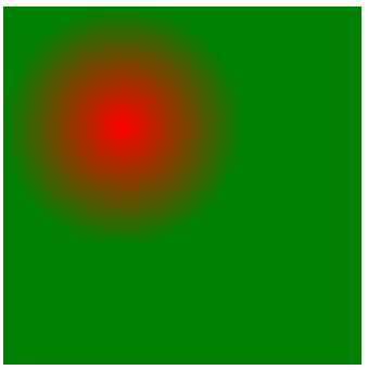
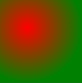
径向渐变:放射性效果background-image: radial-gradient()
默认情况下,径向渐变的形状根据元素的形状来计算
正方形:圆形
长方形:椭圆形
(1)手动指定径向渐变的大小:background-image: radial-gradient(100px 100px,red yellow)
circle正圆;ellipse椭圆;
background-image: radial-gradient(circle,red,yellow)
重复出现效果:background-image:repeating- radial-gradient(100px 100px,red,yellow)
(2)手动指定渐变位置:background-image: radial-gradient(100px 100px at 0 0,red,yellow)
background-image: radial-gradient(closest-side at 100px 100px,red,yellow)
background-image: radial-gradient(farthest-side at 100px 100px,red yellow)
最新文章
- 关于CAP定理的个人理解
- 3.kvm的基本管理
- javascript设计模式与开发实践阅读笔记(4)——单例模式
- Android开发 设置开机自动启动
- Codeforces Round #207 (Div. 1)B(数学)
- Unity NGUI弧形血条的制作
- VLC网页插件添加对火狐浏览器的支持
- Android5.0+(CollapsingToolbarLayout)
- cobaltstrike3.5使用记录
- 【SqlServer系列】表单查询
- python 在大文件里面删除某一行,比较有效率的方法
- JTAG基础知识
- JVM学习八:常用JVM配置参数
- 1.1、Android Studio创建一个项目
- python之路——21
- Django MTV 开发模式 + 数据库配置
- Azure Messaging-ServiceBus Messaging消息队列技术系列1-基本概念和架构
- Python, pandas: how to sort dataframe by index// Merge two dataframes by index
- week6:个人博客作业
- 洛谷 P3749: LOJ 2146: [SHOI2017]寿司餐厅