介绍css 的3D 变换(3D transform)
https://desandro.github.io/3dtransforms/docs/card-flip.html
---------------------------------------------------------------------------------------------------
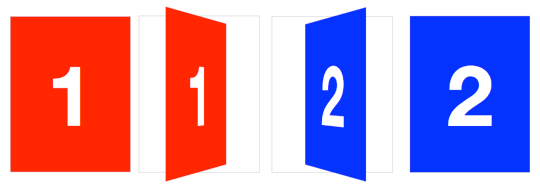
Card Flip
We now have all the tools to start making 3D objects. Let’s get started with the basics, flipping a card.
Here’s the basic markup we’ll need:
<section class="container">

  <div id="card">

    <figure class="front">1</figure>

    <figure class="back">2</figure>

  </div>

</section>
The .container will house the 3D space. The #card acts as a wrapper for the 3D object. Two separate elements for both faces of the card, .front and .back. Even for such a simple object, I recommend using this same pattern for any 3D transform. Keeping the 3D space element and the object separate element establishes a paradigm that is simple to understand and easier to style.
We’re ready for some 3D stylin’. First, apply necessary perspective to the parent 3D space, along with any size or positioning styles.
.container {

  width: 200px;

  height: 260px;

  position: relative;

  perspective: 800px;

}
Now the #card element can be transformed in its parent’s 3D space. We’re using absolute/relative positioning so the 3D object is removed from the flow of the document. We’ll also add @width: 100%; and height: 100%;@. This ensures the object’s transform-origin will occur in the center of container. More on transform-origin later.
Let’s add a CSS3 transition so users can see the transform take effect.
#card {

  width: 100%;

  height: 100%;

  position: absolute;

  transform-style: preserve-3d;

  transition: transform 1s;

}
The .container’s perspective only applies to direct descendant children, in this case #card. In order for subsequent children to inherit a parent’s perspective, and live in the same 3D space, the parent can pass along its perspective with transform-style: preserve-3d. Without 3D transform-style, the faces of the card would be flattened with its parents and the back face’s rotation would be nullified.
To position the faces in 3D space, we’ll need to reset their positions in 2D with position: absolute. In order to hide the back-side of the faces when they are faced away from the viewer, we use backface-visibility: hidden.
#card figure {

  margin: 0;

  display: block;

  position: absolute;

  width: 100%;

  height: 100%;

  backface-visibility: hidden;

}
To flip the .back face, we add a basic 3D transform of rotateY( 180deg ).
#card .front {

  background: red;

}

#card .back {

  background: blue;

  transform: rotateY( 180deg );

}
With the faces in place, the #card requires a corresponding style for when it is flipped.
#card.flipped {

  transform: rotateY( 180deg );

}
Now we have a working 3D object. To flip the card, we can toggle the flipped class. When .flipped, the #card will rotate 180 degrees, thus exposing the .back face.
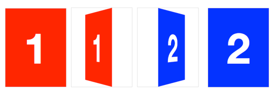
Slide-flip
Take another look at the Weather App 3D transition. You’ll notice that it’s not quite the same effect as our previous demo. If you follow the right edge of the card, you’ll find that it stays flush with the container. Instead of pivoting from the horizontal center, it pivots on that right edge. But the transition is not just a rotation – the edge moves horizontally from right to left. We can reproduce this transition just by modifying a couple lines of CSS from our original card flip demo.
The pivot point for the rotation occurs at the right side of the card. By default, the transform-origin of an element is at its horizontal and vertical center (50% 50% or center center). Let’s change it to the right side:
#card { transform-origin: right center; }That flip now needs some horizontal movement with translateX. We’ll set the rotation to -180deg so it flips right side out.
#card.flipped {

  transform: translateX( -100% ) rotateY( -180deg );

}
最新文章
- jquery文本框内容改变事件
- Session和Cookie的作用以及实现
- BZOJ1046 [HAOI2007]上升序列
- rails创建项目,部署,测试流程(rails5.0+ruby2.3.1)
- ecshop搜索出现相关商品的效果滑动下拉效果
- PHP搜索MYSQL数据库加分页浏览小结
- centos升级openssh的两种方式
- Android_打开多个Activity,返回到第一个Activity
- php 命令空间总结
- 怎样解决canvas 插件 和html 页面中的事件冲突问题 ?
- English trip V2 - 5 Technology Teacher:Taylor Key:adjective + preposition
- python3下最简单的九九乘法表
- 用JDOM和DOM4J解析节点名节点值
- 使用photoshop以及markman进行快速重构页面的几个步骤
- HBase Master高可用(HA)
- Laravel 5.1 中的异常处理器和HTTP异常处理 abort()
- python安装openSSL
- 224. Basic Calculator + 227. Basic Calculator II
- “Hello World!”团队第六周的第二次会议
- mysql视图学习总结(转)