CSS3和jQuery实现的自定义美化Checkbox
2024-10-05 20:24:12
效果图:
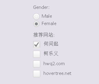
是不是比默认的好看多了,个人的审美观应该还是可以的。
当然我们可以在这里查看DEMO演示。
接下来我们一起来看看实现这款美化版Checkbox的源代码。主要思路是利用隐藏原来的checkbox和radiobox,用一个div来模拟checkbox/radiobox,并使用jQuery来完成选择切换时的动画效果。
先来看看HTML代码:
<div class="wrapper">

        <ul>

            <li>

                <p>Gender:</p>

            </li>

            <li>

                <input type="radio" name="radio-btn" />Male

            </li>

            <li>

                <input type="radio" name="radio-btn" />Female

            </li>

        </ul>

        <ul>

            <li>

                <p>推荐网站:</p>

            </li>

            <li>

                <input type="checkbox" name="check-box" /> <span>何问起</span>

            </li>

            <li>

                <input type="checkbox" name="check-box" /> <span>柯乐义</span>

            </li>

            <li>

                <input type="checkbox" name="check-box" /> <span>hwq2.com</span>

            </li>

            <li>

                <input type="checkbox" name="check-box" /> <span>hovertree.net</span>

            </li>

        </ul>

    </div>
然后我们用jQuery代码来为每一个checkbox和radiobox创建一个div,这个div的classname为check-box和radio-btn。
$("input[name="radio-btn"]").wrap("<div class="radio-btn"><i></i></div>");
$("input[name="check-box"]").wrap("<div class="check-box"><i></i></div>");
那么我们接下来要让原来的checkbox隐藏,同时设置模拟div的样式:
.radio-btn input[type="radio"], .check-box input[type="checkbox"] {
visibility: hidden;
}
.check-box {

    width: 22px;

    height: 22px;

    cursor: pointer;

    display: inline-block;

    margin: 2px 7px 0 0;

    position: relative;

    overflow: hidden;

    box-shadow: 0 0 1px #ccc;

    -webkit-border-radius: 3px;

    -moz-border-radius: 3px;

    border-radius: 3px;

    background: rgb(255, 255, 255);

    background: -moz-linear-gradient(top, rgba(255, 255, 255, 1) 0%, rgba(246, 246, 246, 1) 47%, rgba(237, 237, 237, 1) 100%);

    background: -webkit-gradient(linear, left top, left bottom, color-stop(0%, rgba(255, 255, 255, 1)), color-stop(47%, rgba(246, 246, 246, 1)), color-stop(100%, rgba(237, 237, 237, 1)));

    background: -webkit-linear-gradient(top, rgba(255, 255, 255, 1) 0%, rgba(246, 246, 246, 1) 47%, rgba(237, 237, 237, 1) 100%);

    background: -o-linear-gradient(top, rgba(255, 255, 255, 1) 0%, rgba(246, 246, 246, 1) 47%, rgba(237, 237, 237, 1) 100%);

    background: -ms-linear-gradient(top, rgba(255, 255, 255, 1) 0%, rgba(246, 246, 246, 1) 47%, rgba(237, 237, 237, 1) 100%);

    background: linear-gradient(to bottom, rgba(255, 255, 255, 1) 0%, rgba(246, 246, 246, 1) 47%, rgba(237, 237, 237, 1) 100%);

    filter: progid:DXImageTransform.Microsoft.gradient(startColorstr="#ffffff", endColorstr="#ededed", GradientType=0);

    border: 1px solid #ccc;

}

.check-box i {

    background: url("http://hovertree.com/texiao/html5/32/css/check_mark.png") no-repeat center center;

    position: absolute;

    left: 3px;

    bottom: -15px;

    width: 16px;

    height: 16px;

    opacity: .5;

    -webkit-transition: all 400ms ease-in-out;

    -moz-transition: all 400ms ease-in-out;

    -o-transition: all 400ms ease-in-out;

    transition: all 400ms ease-in-out;

    -webkit-transform:rotateZ(-180deg);

    -moz-transform:rotateZ(-180deg);

    -o-transform:rotateZ(-180deg);

    transform:rotateZ(-180deg);

}

.checkedBox {

    -moz-box-shadow: inset 0 0 5px 1px #ccc;

    -webkit-box-shadow: inset 0 0 5px 1px #ccc;

    box-shadow: inset 0 0 5px 1px #ccc;

    border-bottom-color: #fff;

}

.checkedBox i {

    bottom: 2px;

    -webkit-transform:rotateZ(0deg);

    -moz-transform:rotateZ(0deg);

    -o-transform:rotateZ(0deg);

    transform:rotateZ(0deg);

}

/*Custom radio button*/

 .radio-btn {

    width: 20px;

    height: 20px;

    display: inline-block;

    float: left;

    margin: 3px 7px 0 0;

    cursor: pointer;

    position: relative;

    -webkit-border-radius: 100%;

    -moz-border-radius: 100%;

    border-radius: 100%;

    border: 1px solid #ccc;

    box-shadow: 0 0 1px #ccc;

    background: rgb(255, 255, 255);

    background: -moz-linear-gradient(top, rgba(255, 255, 255, 1) 0%, rgba(246, 246, 246, 1) 47%, rgba(237, 237, 237, 1) 100%);

    background: -webkit-gradient(linear, left top, left bottom, color-stop(0%, rgba(255, 255, 255, 1)), color-stop(47%, rgba(246, 246, 246, 1)), color-stop(100%, rgba(237, 237, 237, 1)));

    background: -webkit-linear-gradient(top, rgba(255, 255, 255, 1) 0%, rgba(246, 246, 246, 1) 47%, rgba(237, 237, 237, 1) 100%);

    background: -o-linear-gradient(top, rgba(255, 255, 255, 1) 0%, rgba(246, 246, 246, 1) 47%, rgba(237, 237, 237, 1) 100%);

    background: -ms-linear-gradient(top, rgba(255, 255, 255, 1) 0%, rgba(246, 246, 246, 1) 47%, rgba(237, 237, 237, 1) 100%);

    background: linear-gradient(to bottom, rgba(255, 255, 255, 1) 0%, rgba(246, 246, 246, 1) 47%, rgba(237, 237, 237, 1) 100%);

    filter: progid:DXImageTransform.Microsoft.gradient(startColorstr="#ffffff", endColorstr="#ededed", GradientType=0);

}

.checkedRadio {

    -moz-box-shadow: inset 0 0 5px 1px #ccc;

    -webkit-box-shadow: inset 0 0 5px 1px #ccc;

    box-shadow: inset 0 0 5px 1px #ccc;

}

.radio-btn i {

    border: 1px solid #E1E2E4;

    width: 10px;

    height: 10px;

    position: absolute;

    left: 4px;

    top: 4px;

    -webkit-border-radius: 100%;

    -moz-border-radius: 100%;

    border-radius: 100%;

}

.checkedRadio i {

    background-color: #898A8C;

}/* 何问起 hovertree.com */
上面这段CSS3代码就是用样式来自定义div,让div的样式和checkbox和radiobox一样。
最后我们来模拟点击选中和取消选中,这部分也是用jQuery来实现:
$(".radio-btn").on("click", function () {

    var _this = $(this),

        block = _this.parent().parent();

    block.find("input:radio").attr("checked", false);

    block.find(".radio-btn").removeClass("checkedRadio");

    _this.addClass("checkedRadio");

    _this.find("input:radio").attr("checked", true);

});

$.fn.toggleCheckbox = function () {

    this.attr("checked", !this.attr("checked"));

}

$(".check-box").on("click", function () {

    $(this).find(":checkbox").toggleCheckbox();

    $(this).toggleClass("checkedBox");

});/* 何问起 hovertree.com */
在线演示:http://hovertree.com/texiao/html5/32/
转自:http://hovertree.com/h/bjaf/css3checkbox.htm
特效库:http://www.cnblogs.com/roucheng/p/texiao.html
最新文章
- Linux.NET学习手记(8)
- css定位position认识
- IIS限制ip访问
- linux下安装openssh-server
- java笔记--异常详解与处理
- ArcGIS API for Silverlight之配准JPG图片地图文字倾斜解决方案
- spring mvc中的json整合
- C#利用最新版的WPS实现导入导出
- 琐碎-关于Windows调试hadoop
- 微信分享,使用js,分享给朋友,朋友圈,QQ微博
- php导出execl
- sharepoint 2010 列表数据分页控件介绍 pagination UserControl
- STL之set、multiset、functor&pair使用方法
- WAS下获取包路径下所有类
- python常用模块上篇
- mysql按天,按周,按月,按季度,按年统计数据
- 设计模式(四) Factory Pattern工厂模式
- CentOS 网络设置修改 2
- [LOJ 6030]「雅礼集训 2017 Day1」矩阵
- spring4 知识点