html+ccs3太阳系行星运转动画
做一个太阳系八大行星的运转动画,不包括行星的卫星,所有行星围绕太阳公转,行星采用纯色,暂时没有自转。
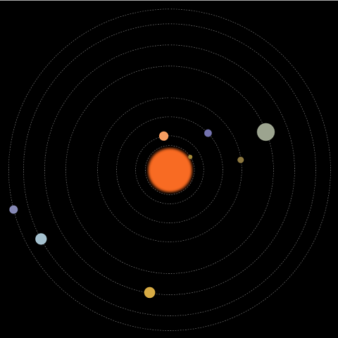
效果静态图:
动画中包括:太阳及各行星,运行轨道,行星公转动画。
先画好草图,设计好大小和位置,根据公转周期计算好动画执行的时间。
html的结构:
一个class为solarsys的div,作为太阳系容器元素,该div的position为relative。
行星轨道和行星都用div,position为absolute。
容器用relative和内部元素采用absolute的定位方式,比较简单的能实现效果,缺点就是大小是固定的。
    <div class="solarsys">

        <!--太阳-->

        <div class='sun'></div>

        <!--水星轨道-->

        <div class='mercuryOrbit'></div>

        <!--水星-->

        <div class='mercury'></div>

        <!--金星轨道-->

        <div class='venusOrbit'></div>

        <!--金星-->

        <div class='venus'></div>

        <!--地球轨道-->

        <div class='earthOrbit'></div>

        <!--地球-->

        <div class='earth'></div>

        <!--火星轨道-->

        <div class='marsOrbit'></div>

        <!--火星-->

        <div class='mars'></div>

        <!--木星轨道-->

        <div class='jupiterOrbit'></div>

        <!--木星-->

        <div class='jupiter'></div>

        <!--土星轨道-->

        <div class='saturnOrbit'></div>

        <!--土星-->

        <div class='saturn'></div>

        <!--天王星轨道-->

        <div class='uranusOrbit'></div>

        <!--天王星-->

        <div class='uranus'></div>

        <!--海王星轨道-->

        <div class='neptuneOrbit'></div>

        <!--海王星-->

        <div class='neptune'></div>

    </div>
太阳系容器div的css:
定宽,定高,relative定位,页面内剧中对齐。
        .solarsys{

            width: 800px;

            height: 800px;;

            position: relative;

            margin: 0 auto;

            background-color: #000000;

            padding: 0;

            transform: scale(1);

        }
太阳div的css:
按照设计的大小和位置,设定宽高,left,top。
设定颜色。
通过把boder-radius生成50%,把一个正方形变成圆形。
通过box-shadow的4层颜色设置实现太阳光晕。
        .sun {

            left:357px;

            top:357px;

            height: 90px;

            width: 90px;

            background-color: rgb(248,107,35);

            border-radius: 50%;

            box-shadow: 5px 5px 10px rgb(248,107,35), -5px -5px 10px rgb(248,107,35), 5px -5px 10px rgb(248,107,35), -5px 5px 10px rgb(248,107,35);

            position: absolute;

            margin: 0;

        }
行星轨道div的css:
假设是水星轨道。
按照设计的大小和位置,设定宽高,left,top。
背景色透明。
通过把boder-radius生成50%,把一个正方形变成圆形。
boder的类型设成虚线。
boder的颜色设成灰色。
宽度设1。
        .mercuryOrbit {

            left:342.5px;

            top:342.5px;

            height: 115px;

            width: 115px;

            background-color: transparent;

            border-radius: 50%;

            border-style: dashed;

            border-color: gray;

            position: absolute;

            border-width: 1px;

            margin: 0px;

            padding: 0px;

        }
行星div的css:
假设是水星。
按照设计的大小和位置,设定宽高,left,top。
设置颜色。
通过把boder-radius生成50%,把一个正方形变成圆形。
将transfrom-origin设定成当前div的左上角相对于整个太阳系容器的中心点的横向和纵向的偏移量。加上旋转动画后就是围绕着中心点旋转效果。
做一个animation,引用rotate关键帧动画,线性永久执行,这里的执行时长是根据行星的公转周期计算出来。
        .mercury {

            left:337.5px;

            top:395px;

            height: 10px;

            width: 10px;

            background-color: rgb(166,138,56);

            border-radius: 50%;

            position: absolute;

            transform-origin: 62.5px 5px;

            animation: rotate 1.5s infinite linear;

        }
rotate关键帧动画:
逆时针旋转。
        @keyframes rotate {

            100% {

                transform: rotate(-360deg);

            }

        }
基本结构完成。
仅在chrome中测试过。
全部代码:
<html>

<head>

    <style>

        .solarsys{

            width: 800px;

            height: 800px;;

            position: relative;

            margin: 0 auto;

            background-color: #000000;

            padding: 0;

            transform: scale(1);

        }

        /*太阳*/

        .sun {

            left:357px;

            top:357px;

            height: 90px;

            width: 90px;

            background-color: rgb(248,107,35);

            border-radius: 50%;

            box-shadow: 5px 5px 10px rgb(248,107,35), -5px -5px 10px rgb(248,107,35), 5px -5px 10px rgb(248,107,35), -5px 5px 10px rgb(248,107,35);

            position: absolute;

            margin: 0;

        }

        /*水星*/

        .mercury {

            left:337.5px;

            top:395px;

            height: 10px;

            width: 10px;

            background-color: rgb(166,138,56);

            border-radius: 50%;

            position: absolute;

            transform-origin: 62.5px 5px;

            animation: rotate 1.5s infinite linear;

        }

        /*水星轨道*/

        .mercuryOrbit {

            left:342.5px;

            top:342.5px;

            height: 115px;

            width: 115px;

            background-color: transparent;

            border-radius: 50%;

            border-style: dashed;

            border-color: gray;

            position: absolute;

            border-width: 1px;

            margin: 0px;

            padding: 0px;

        }

        /*金星*/

        .venus {

            left:309px;

            top:389px;

            height: 22px;

            width: 22px;

            background-color: rgb(246,157,97);

            border-radius: 50%;

            position: absolute;

            transform-origin: 91px 11px;

            animation: rotate 3.84s infinite linear;

        }

        /*金星轨道*/

        .venusOrbit {

            left:320px;

            top:320px;

            height: 160px;

            width: 160px;

            background-color: transparent;

            border-radius: 50%;

            border-style: dashed;

            border-color: gray;

            position: absolute;

            border-width: 1px;

            /*margin: 100px;*/

            /*transform-origin: -75px -75px;*/

            /*animation: rotate 4s infinite linear;*/

            margin: 0px;

            padding: 0px;

        }

        /*地球*/

        .earth {

            left:266.5px;

            top:391px;

            height: 18px;

            width: 18px;

            background-color: rgb(115,114,174);

            border-radius: 50%;

            position: absolute;

            transform-origin: 134px 9px;

            animation: rotate 6.25s infinite linear;

        }

        /*地球轨道*/

        .earthOrbit {

            left:275px;

            top:275px;

            height: 250px;

            width: 250px;

            background-color: transparent;

            border-radius: 50%;

            border-style: dashed;

            border-color: gray;

            position: absolute;

            border-width: 1px;

            /*margin: 100px;*/

            /*transform-origin: -75px -75px;*/

            /*animation: rotate 4s infinite linear;*/

            margin: 0px;

            padding: 0px;

        }

        /*火星*/

        .mars {

            left:222.5px;

            top:392.5px;

            height: 15px;

            width: 15px;

            background-color: rgb(140,119,63);

            border-radius: 50%;

            position: absolute;

            transform-origin: 177.5px 7.5px;

            animation: rotate 11.75s infinite linear;

        }

         /*火星轨道*/

        .marsOrbit {

            left:230px;

            top:230px;

            height: 340px;

            width: 340px;

            background-color: transparent;

            border-radius: 50%;

            border-style: dashed;

            border-color: gray;

            position: absolute;

            border-width: 1px;

            /*margin: 100px;*/

            /*transform-origin: -75px -75px;*/

            /*animation: rotate 4s infinite linear;*/

            margin: 0px;

            padding: 0px;

        }

        /*木星*/

        .jupiter {

            left:134px;

            top:379px;

            height: 42px;

            width: 42px;

            background-color: rgb(156,164,143);

            border-radius: 50%;

            position: absolute;

            transform-origin: 266px 21px;

            animation: rotate 74.04s infinite linear;

        }

        /*木星轨道*/

        .jupiterOrbit {

            left:155px;

            top:155px;

            height: 490px;

            width: 490px;

            background-color: transparent;

            border-radius: 50%;

            border-style: dashed;

            border-color: gray;

            position: absolute;

            border-width: 1px;

            /*margin: 100px;*/

            /*transform-origin: -75px -75px;*/

            /*animation: rotate 4s infinite linear;*/

            margin: 0px;

            padding: 0px;

        }

        /*土星*/

        .saturn {

            left:92px;

            top:387px;

            height: 26px;

            width: 26px;

            background-color: rgb(215,171,68);

            border-radius: 50%;

            position: absolute;

            transform-origin: 308px 13px;

            animation: rotate 183.92s infinite linear;

        }

        /*土星轨道*/

        .saturnOrbit {

            left:105px;

            top:105px;

            height: 590px;

            width: 590px;

            background-color: transparent;

            border-radius: 50%;

            border-style: dashed;

            border-color: gray;

            position: absolute;

            border-width: 1px;

            /*margin: 100px;*/

            /*transform-origin: -75px -75px;*/

            /*animation: rotate 4s infinite linear;*/

            margin: 0px;

            padding: 0px;

        }

        /*天王星*/

        .uranus {

            left:41.5px;

            top:386.5px;

            height: 27px;

            width: 27px;

            background-color: rgb(164,192,206);

            border-radius: 50%;

            position: absolute;

            transform-origin: 358.5px 13.5px;

            animation: rotate 524.46s infinite linear;

        }

        /*天王星轨道*/

        .uranusOrbit {

            left:55px;

            top:55px;

            height: 690px;

            width: 690px;

            background-color: transparent;

            border-radius: 50%;

            border-style: dashed;

            border-color: gray;

            position: absolute;

            border-width: 1px;

            /*margin: 100px;*/

            /*transform-origin: -75px -75px;*/

            /*animation: rotate 4s infinite linear;*/

            margin: 0px;

            padding: 0px;

        }

        /*海王星*/

        .neptune {

            left:10px;

            top:390px;

            height: 20px;

            width: 20px;

            background-color: rgb(133,136,180);

            border-radius: 50%;

            position: absolute;

            transform-origin: 390px 10px;

            animation: rotate 1028.76s infinite linear;

        }

        /*海王星轨道*/

        .neptuneOrbit {

            left:20px;

            top:20px;

            height: 760px;

            width: 760px;

            background-color: transparent;

            border-radius: 50%;

            border-style: dashed;

            border-color: gray;

            position: absolute;

            border-width: 1px;

            /*margin: 100px;*/

            /*transform-origin: -75px -75px;*/

            /*animation: rotate 4s infinite linear;*/

            margin: 0px;

            padding: 0px;

        }

        @keyframes rotate {

            100% {

                transform: rotate(-360deg);

            }

        }

    </style>

</head>

<body>

    <div class="solarsys">

        <!--太阳-->

        <div class='sun'></div>

        <!--水星轨道-->

        <div class='mercuryOrbit'></div>

        <!--水星-->

        <div class='mercury'></div>

        <!--金星轨道-->

        <div class='venusOrbit'></div>

        <!--金星-->

        <div class='venus'></div>

        <!--地球轨道-->

        <div class='earthOrbit'></div>

        <!--地球-->

        <div class='earth'></div>

        <!--火星轨道-->

        <div class='marsOrbit'></div>

        <!--火星-->

        <div class='mars'></div>

        <!--木星轨道-->

        <div class='jupiterOrbit'></div>

        <!--木星-->

        <div class='jupiter'></div>

        <!--土星轨道-->

        <div class='saturnOrbit'></div>

        <!--土星-->

        <div class='saturn'></div>

        <!--天王星轨道-->

        <div class='uranusOrbit'></div>

        <!--天王星-->

        <div class='uranus'></div>

        <!--海王星轨道-->

        <div class='neptuneOrbit'></div>

        <!--海王星-->

        <div class='neptune'></div>

    </div>

</body>

</html>
最新文章
- UML大战需求分析阅读笔记2
- python 进程间共享数据 (一)
- Android 首页图片轮播
- Linux 下从头再走 GTK+-3.0 (六)
- EF实体框架之CodeFirst二
- [Ubuntu] Ubuntu13.04, the desktop freezed after login
- C++ 并发消息队列
- java基础三种循环的使用及区别
- POJ2104&&HDU2665(静态区间第K小)
- .net 微信APP支付接口的开发流程以及坑
- OWIN– 解耦,协作和开放
- AS3中释放优化的几条常识
- Unity 之 c# 版的 CharacterMotor
- sql注入--双查询报错注入
- Nacos 发布 v0.8.0 Pre-GA版本,安全稳定上生产?
- [转帖]linux 清空history以及记录原理
- Mysql 千万级别数据数据查询
- php 字符串截取函数
- AMAZON数据集
- IOS方形头像如何变成圆形